
 On 5 May it was announced that the U.K.’s death toll from COVID-19 was 29,427, narrowly overtaking Italy on the same day (with 29,315 deaths): this meant that the U.K. had the highest number of recorded COVID-19 deaths in Europe.
Professor of Economics, Edmund Cannon, explores the need to handle statistics with care in relation to the Coronavirus pandemic.
Apart from the morbid fascination in comparing different countries’ position in the death-toll league table, international comparisons are potentially very important because they enable us to evaluate the success or failure of different ways of dealing with the illness. Public policy makers need some form of evidence as to what works so that they can implement good policies. Voters need to know how well their elected governments performed so that they can reward – or punish – politicians at the next election.

Unfortunately, comparing deaths is a fiddly exercise and the data need to be handled with care. In another blog, my colleagues Sarah Smith and Steven Proud have discussed how difficult it is to measure the number of deaths from COVID-19 within the U.K.: making comparisons between countries is even more difficult because countries have different procedures for recording deaths and different policies on testing for COVID-19. But, even if we had perfect data, comparison of countries would be difficult, because we should expect death rates to differ between countries because they have very different populations.
The first difference is that the U.K. has a larger population than Italy. In Figure 1 I report data from Wikipedia showing that the U.K. is about thirteen per cent larger than Italy. If we looked not at the number of deaths but the deaths relative to population, the U.K. actually has a lower death rate than Italy, 433 per million compared to 486 per million. Of course, these death data may not be entirely reliable: the point here is that even if they were perfectly reliable, it would be strange to compare them without taking account of the population too.
|
Population |
No. of deaths (ii) |
Death rate per million |
|
|
Italy |
60317116 | 29315 |
486 |
| UK | 67886004 | 29427 |
433 |
Sources: population from Wikipedia; deaths from BBC.

This suggests that we should prefer death rates over the number of deaths. But the U.K. does not just have a larger population than Italy, it also has a younger population and this is relevant for making comparisons, as we know that older people are much less likely to recover from COVID-19 than younger people. Since the U.K. has a younger population than Italy, we should expect it to have a lower death rate.
Figure 1 below illustrates the differences in population between the U.K. and four other European countries. The blue bars illustrate the proportion of the population of each age for the United Kingdom (these data are taken from the Human Mortality Database and are from 2016, which is the most recent year available for all countries). The proportion of the U.K. population which is any age between zero (i.e. babies who have not yet had their first birthday) and seventy is a bit over one per cent: compared with other ages, there are slightly fewer people aged about fifteen or forty and there is a noticeable “spike” of people aged seventy (due to the boom in childbirths immediately after the second world war).
Figure 1.
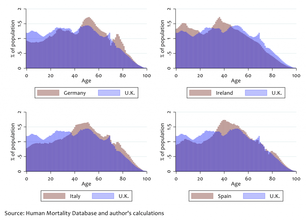
The corresponding population proportions for the other four countries are reported in pale brown and are overlaid on the UK data for comparison. For Germany, Italy and Spain the proportion of relatively young people (aged 35 or less) is much lower; there are more middle-aged and elderly people. The exception is Ireland, whose population is much younger on average.

From these data we should expect the U.K. to have a lower death rate than Germany, Italy and Spain, but a higher death rate than Ireland. But how much lower (or higher)?
I have been unable to find data on age-specific death rates for COVID-19, but one informal approximation is that the death rate due to COVID-19 is roughly the same as the underlying death rate and I have been able to find those data from the Human Mortality Database. Suppose this is approximately correct: how would death rates compare? I calculate the average age-specific death rate for all five countries and then use that with the data from Figure 1 to get overall expected death rates. Figure 2 reports the results of my calculations and shows how aggregate death rates should compare to the U.K., which I have normalised to one hundred.
Figure 2.
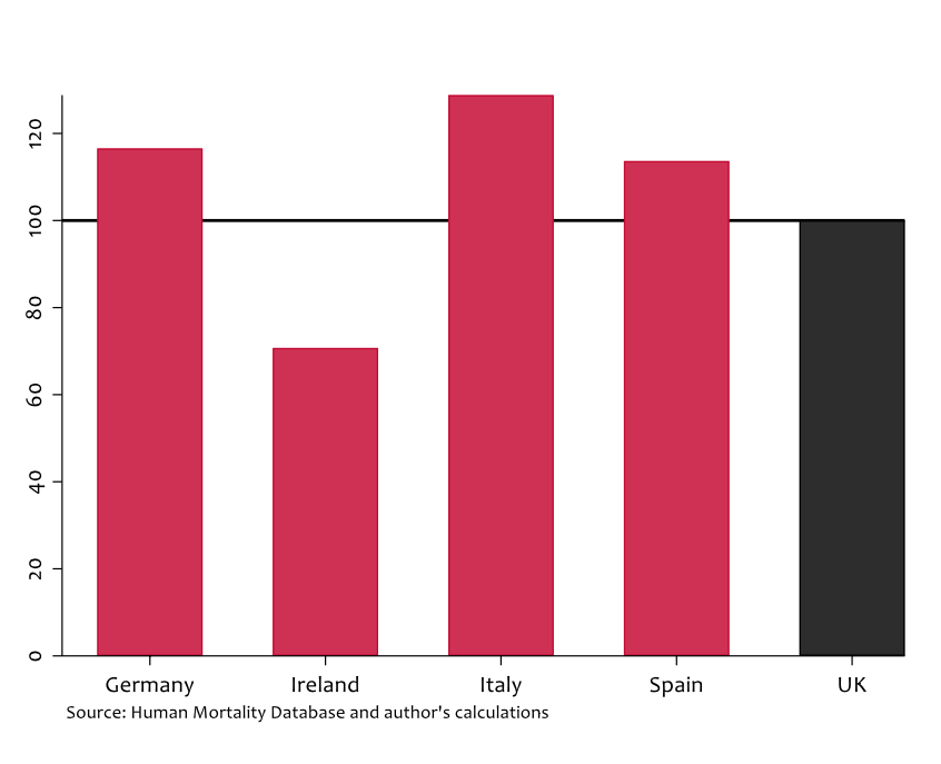
According to these calculations we should expect the death rate for Italy to be 29 per cent higher than in the U.K. purely on the basis of it having an older population; we should also expect higher death rates for Germany and Spain. The graph shows that the age composition of a population could result in very different aggregate death rates. On this basis, the fact that Italy’s death rate appears to be twelve per cent higher (486 per million compared to 433 per million) would suggest that the U.K. has been hit harder by COVID-19 than Italy.
As I have mentioned several times in this blog, we still do not have reliable death data. I have tried to show that even if we did have such data, their interpretation would be difficult due to age composition. Without careful interpretation of the data, drawing up league tables of deaths might provide morbid fascination, but provides little information about the success of government policies.
Data used in this blog were taken from the Human Mortality Database, University of California, Berkeley (USA), and Max Planck Institute for Demographic Research (Germany). Available at www.mortality.org or www.humanmortality.de (data downloaded on 1 May 2020).